Watson Orchard
SERVICES
Branding
Brand Guidelines
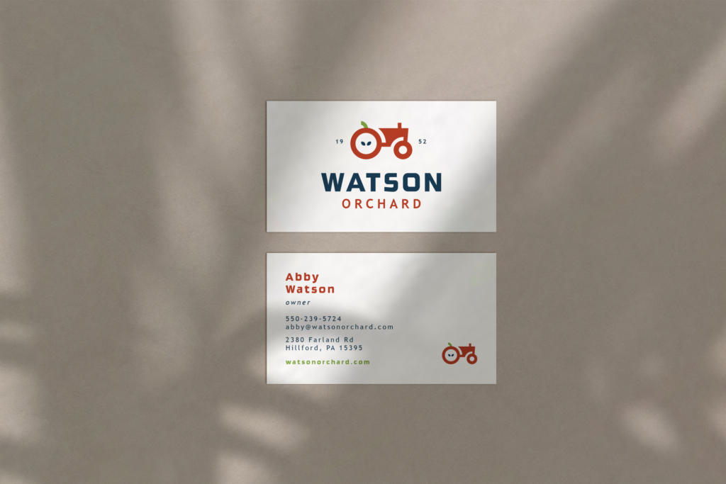
Business Card
Social Media Templates
Website
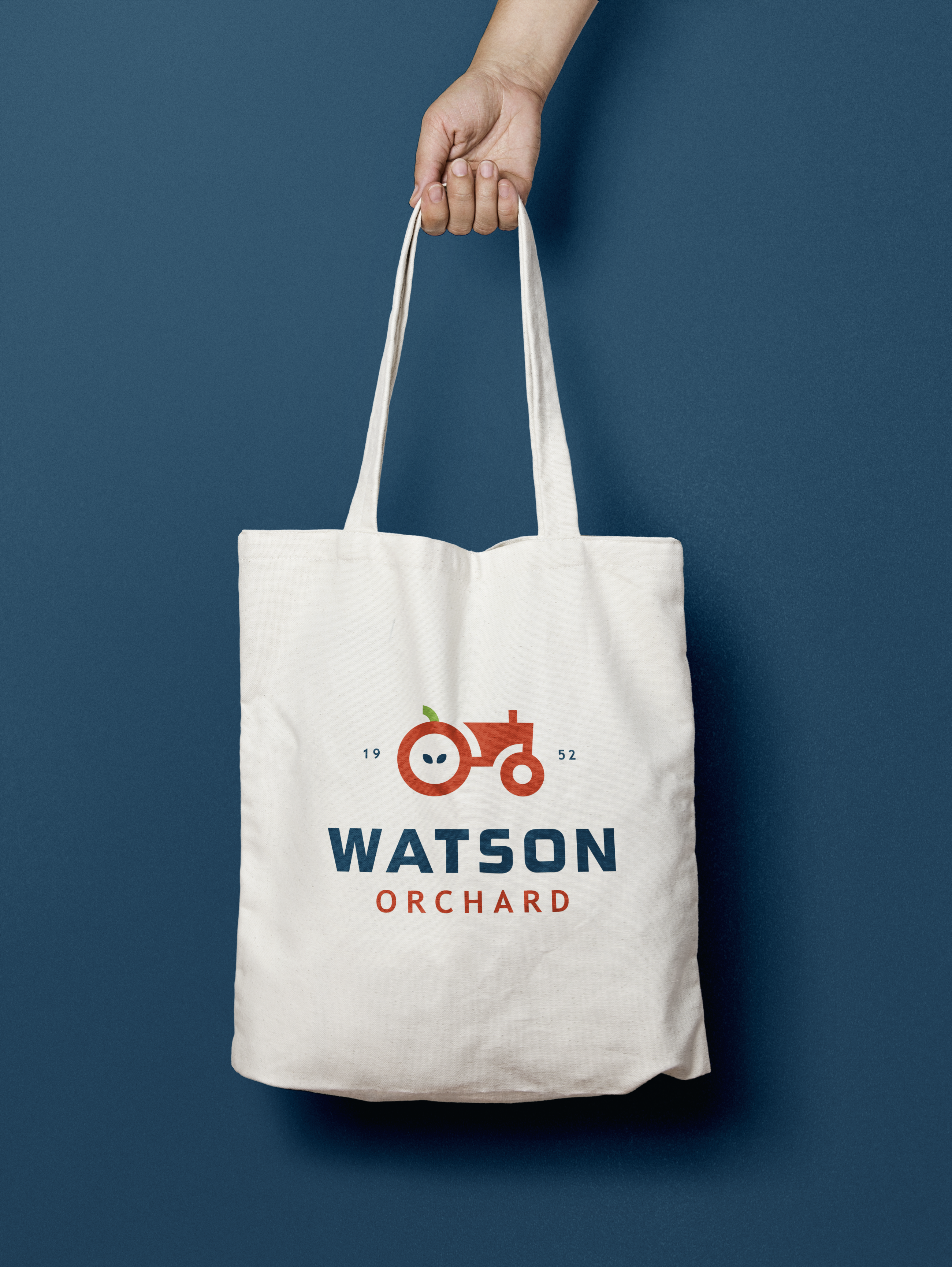
The fictional Watson Orchard brand is vibrant and full of life. The color palette includes a primary dark blue complemented by apple red accents, with light green and yellow used sparingly to add pops of color.
The logo incorporates an apple with seeds into a tractor tire and uses the stem as the seat, creating a cohesive and memorable design. This thoughtful branding captures the essence of Watson Orchard as a lively, welcoming, and family-friendly place.